Define
The research was exciting but I wanted to focus my team's effort on one thing and not get overwhelmed with the key insights, so I created a problem statement for Kassidy.
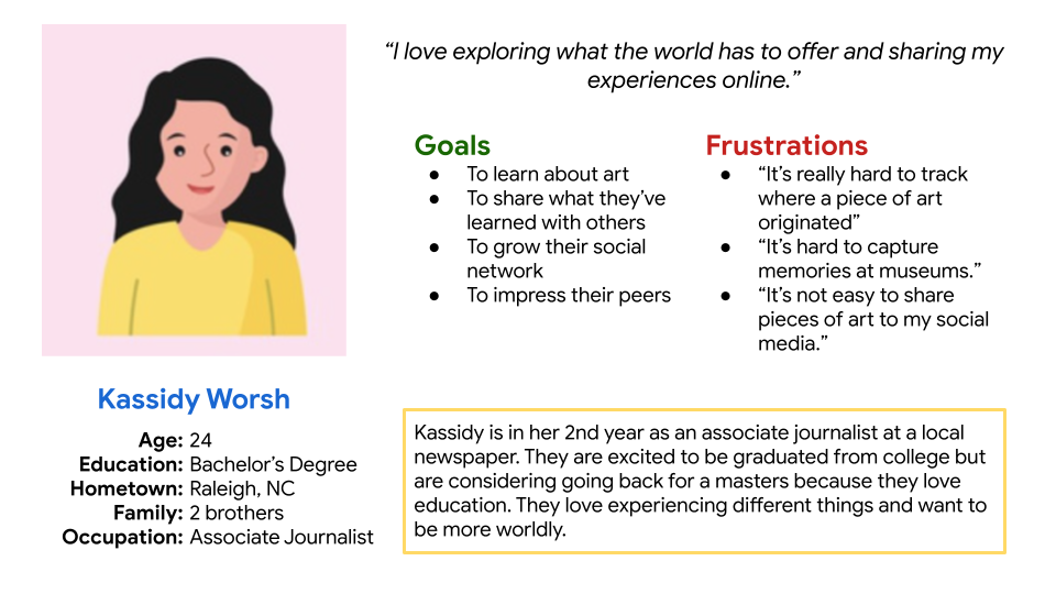
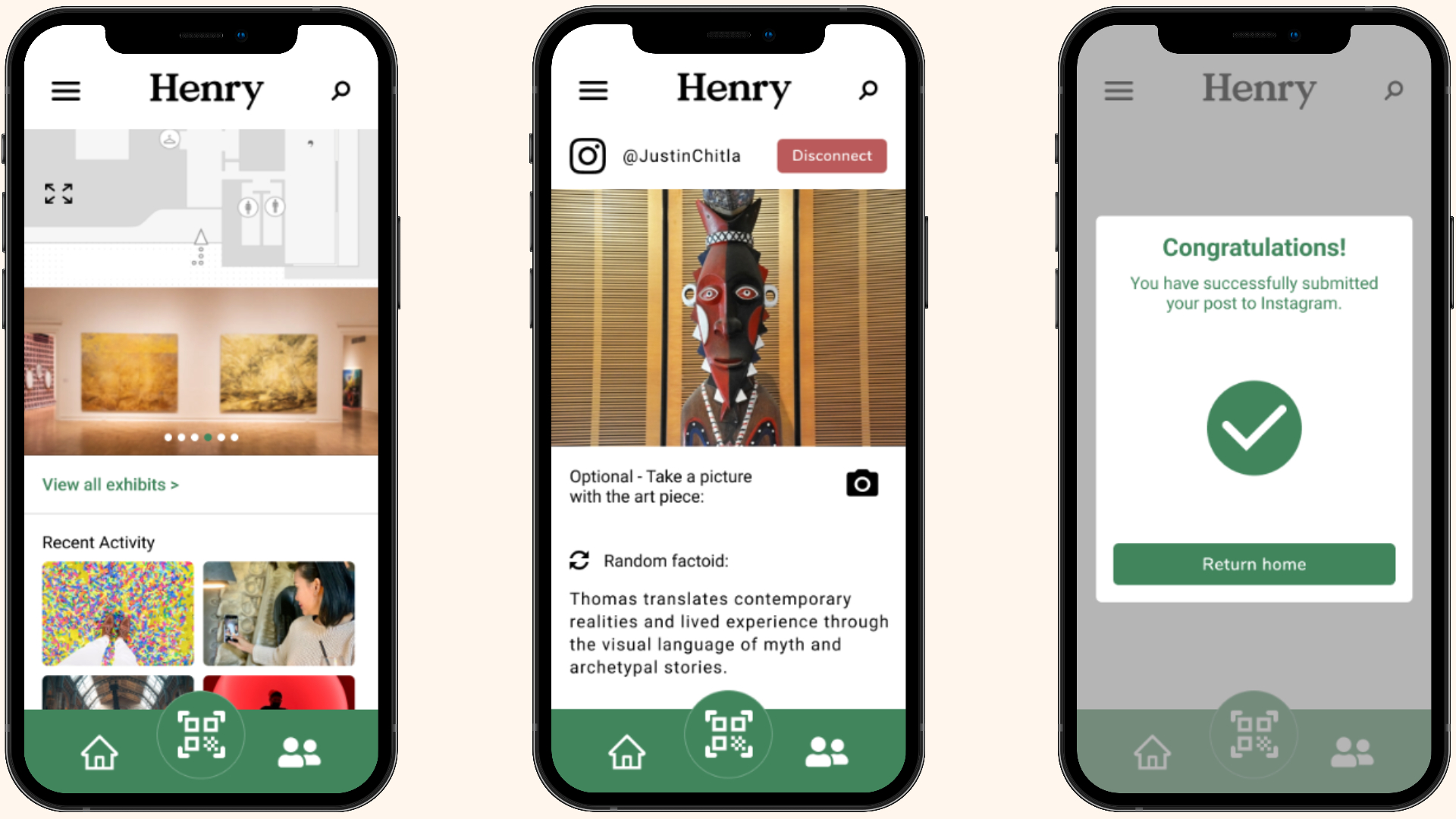
Kassidy is a social young professional who needs to easily share what she learns in an art museum to her social media because she is growing her online/professional presence on her social media.
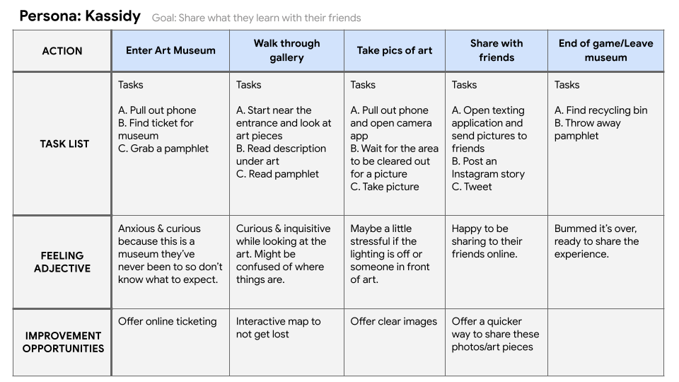
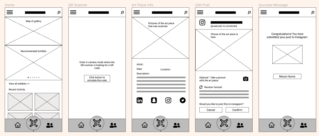
After setting my focus on one problem, I conducted a competitive audit to see what solutions were out there for other art galleries and even museums. I wanted to get a feel for the style, navigation, ease-of-use, and feature set that our users were used to. Using the audit to guide me, I set my focus on 3 core functionalities that my design had to include in order to solve for my target problem statement.
Core functionalities
- Easy to use map of the art gallery
- Ability to easily learn more about an art piece
- Ability to to share art pieces to social media
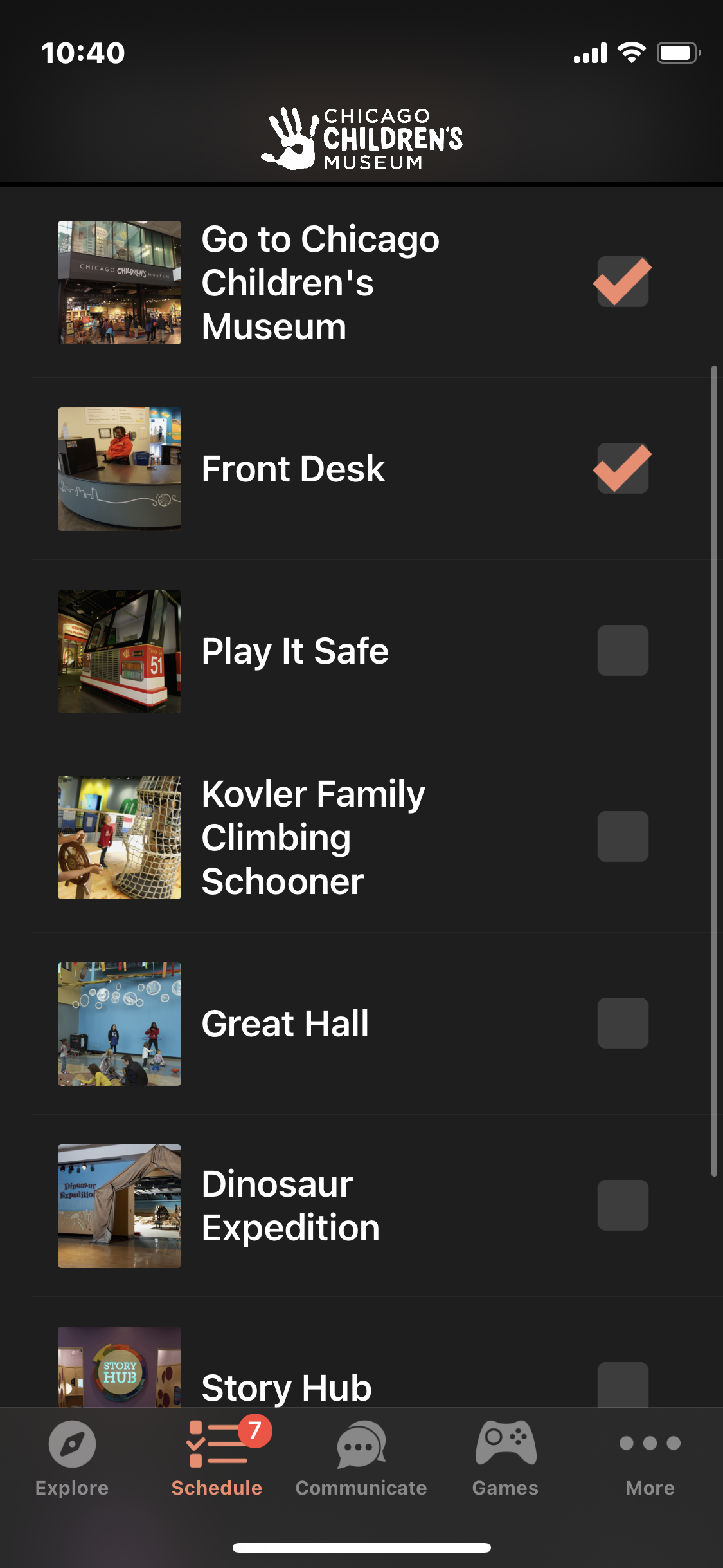
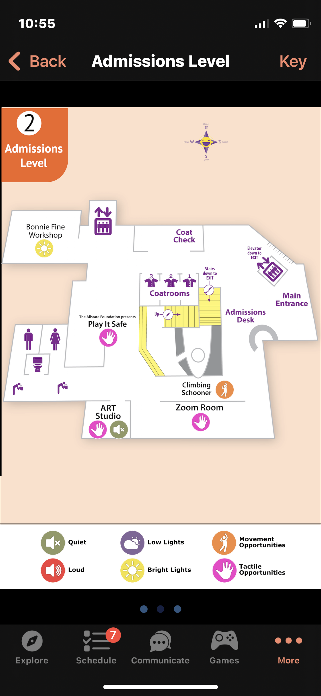
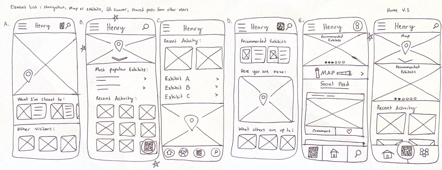
Example screens from similar apps.
%20(1).png)
.png)